
Project Description
“DCT Electrical Services” is a local husband and wife team servicing anything from cabinet lighting, ceiling fans, and electrical panels.
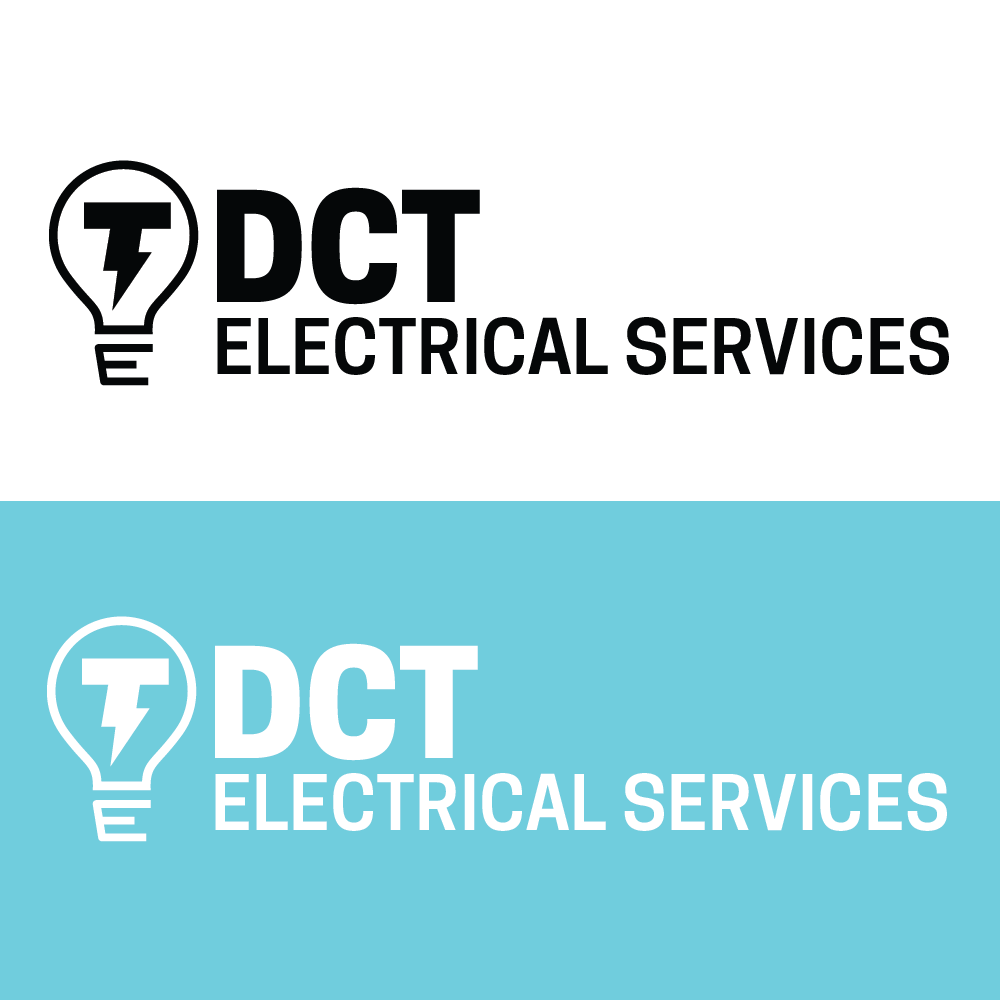
Adobe Illustrator was used to create a modern-looking mark that — while maintaining professionalism — would still have a touch of fun in its design. This is achieved with a lighter shade of blue than the “more serious” dark, or navy, blue and use of sans-serif fonts/typefaces. “DCT” — the client’s full name — was made to stand out bold in comparison with “Electrical Services” to establish balance and proper priority.
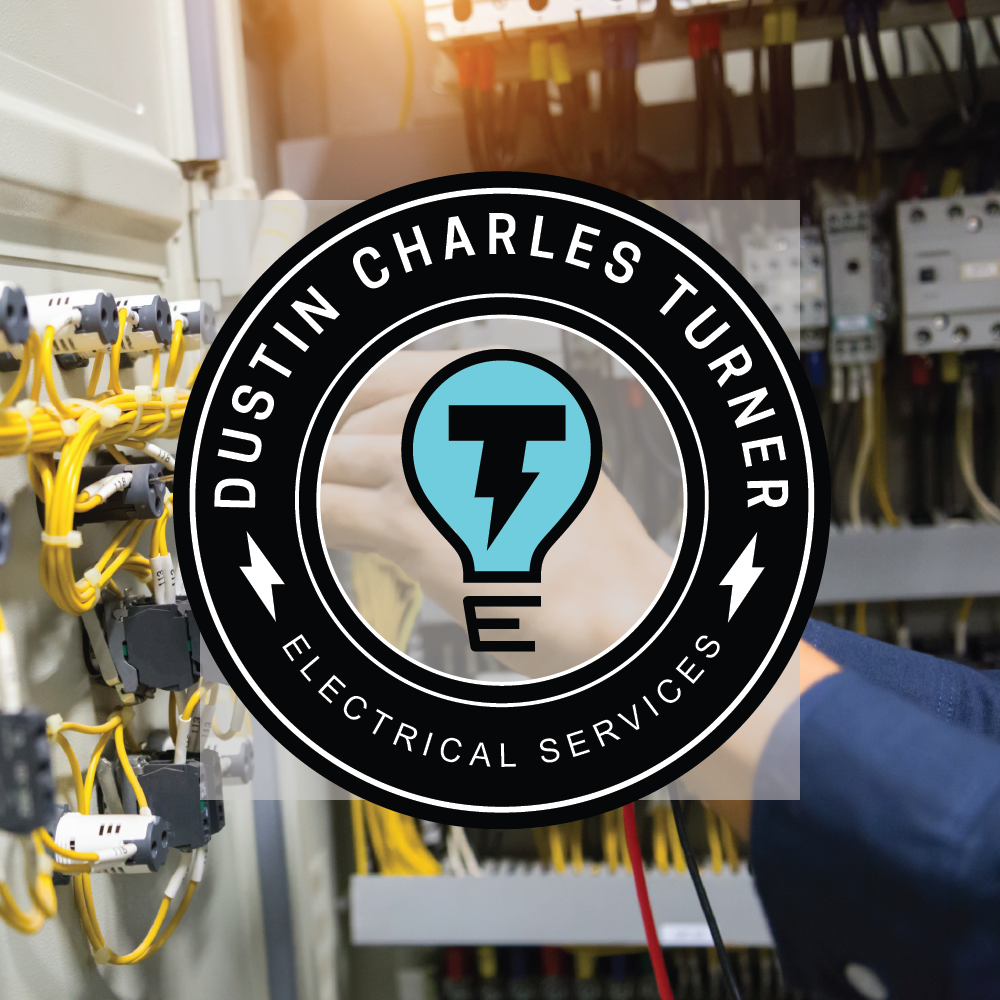
As for the mark, the light bulb was an obvious choice for an electrician. However every detail of this logo was used to represent its brand; the lightning bolt in place of the filament in the shape of a “T”, husband/wife duo’s shared last name. The base of the bulb was artistically made to also look like an “E” for “Electrical” or “Electric” — the services this company provides.
An alternate badge-like logo was made to be reminiscent of the “old-timey”/retro logos of electrical servicing companies of the 50’s — 70’s to achieve a sense of reliability, hard work, and trustworthiness. This circular logo is also perfect for profile pictures of social media sites such as Instagram, Twitter, or Facebook that are essential for reaching clients.
